◆ The Bay Shore Power House
In short: It was a power generating station operated in the early part of the twentieth century to provide electricity to a nearby trolley line and amusement park.
The not-so-short explanation follows.
§ Background
Some information is needed to set the stage before we get to the power house itself.
# North Point and Sparrows Point
The land southeast of Dundalk forms a peninsula that frames the east side of the Patapsco River. One of the earliest names for the tip of that peninsula was North Point, named by and after Captain Robert North. Captain North was one of the original land owners in Baltimore when the city was formed in the early eighteenth century. North Point was used by the US military to build defensive structures in the late nineteenth century; the installation was named Fort Howard and was intended to protect the Baltimore Inner Harbor and, to a degree, the upper Chesapeake Bay from naval incursion. (The land is now divided between a county park and a fenced off, abandoned former Veterans Administration hospital.)
Just upstream from North Point on the Patapsco River is Sparrows Point, land named by and after Thomas Sparrow, Jr. He was granted the land in the mid seventeenth century by the Second Baron Baltimore, then the English proprietor of the colony of Maryland. In the late nineteenth century, the land was developed into a steel plant by the Pennsylvania Steel Company. It was purchased by Bethlehem Steel in 1916. (The steel plant was operated by Bethlehem Steel until the latter’s bankruptcy in 2001. It was then sold among several different companies through the following decade until it was decommissioned in 2012 after years of declining utilization. Sparrows Point has since been redeveloped into a logistics hub, connecting sea, rail, and truck transportation of a wide variety of goods.)
# Baltimore’s Trolleys
There were a number of companies operating electric trolleys in Baltimore in the late nineteenth century, but all of them merged together in 1899 to form the United Railways and Electric Company. That consolidated company, often referred to as UR&E, both operated a number of trolley lines and several power plants. The power plants gave the company direct control over the bulk of the power its trolleys used. Power was also sold to other customers.
UR&E acquired a few power plants through corporate consolidation, but its primary source of electricity came from the Pratt Street Power Plant. (The latter facility ceased generating power in 1973, but has in the years since hosted a number of significant tenants, including an indoor Six Flags, an ESPN Zone, a Barnes & Noble, and a Hard Rock Cafe.)
In 1903, UR&E, through a subsidiary, built a rail line to Sparrows Point and the steel plant that operated there. That line was called the Sparrows Point Line and given the number 24. (It would later be renumbered as 26.)
# Bay Shore Park
In 1906, UR&E built an amusement park near North Point on the shore of the Chesapeake Bay. They named the park the Bay Shore Amusement Park, often shortened to just Bay Shore Park. These sorts of parks were not uncommon for trolley companies of the day; such parks provided significant income for the companies from both the money spent at the parks and the fares paid to travel to the parks via trolley. These parks were often referred to as trolley parks; one of the better-known ones is probably Coney Island in New York City. At the time, there were several other such parks operating in the Baltimore area already.
Bay Shore Park was a popular destination for Baltimore residents for nearly half a decade. It had a high class restaurant and a number of entertainments and rides, several of which took advantage of the proximity of the bay. One of the more unique and popular attractions it had when it opened was the Sea Swing, also called the “People Dipper”. It was a set of swings that were spun around in a circle, much like modern amusement parks’ swing rides. The Sea Swing, however, was out in the water and would swing people at least partially into the bay. Other attractions included water slides and toboggans that terminated in the bay. The park would rent swimming suits to people who hadn’t brought their own. There were, of course, attractions that didn’t require getting wet, like a roller coaster, a movie theater, and a bowling alley.
Access to the park was provided by an extension of the Sparrows Point Line. The extension operated as a loop: trolley cars would leave Sparrows Point, travel out to Bay Shore Park, head along the shore to Fort Howard, then loop back to Sparrows Point. (Or the trolley cars might have gone in the other direction, visiting Fort Howard before Bay Shore Park. I’ve found conflicting descriptions of the route.)
It’s worth pointing out that Bay Shore Park, like many places at the time, was racially restricted. Only white people were allowed in. I’ve been unable to determine if it was ever desegregated, or if black people were still being denied access when it closed in 1946. The latter seems likely, based on the number of places in Baltimore that remained segregated into the 1950s.
§ Bay Shore Power House
The power house in 1924, according to the Maryland Rail Heritage Library
# The United Railways and Electric Company’s Power Needs
After the initial construction on the Bay Shore extension to the Sparrows Creek Line and the Bay Shore Park, UR&E decided it needed to build a new power source near the park to accommodate the additional load being added. They determined that building a new facility would be cheaper than adding both more capacity to the Pratt Street Power Plant and appropriate infrastructure to carry the electricity down to where it would be needed.
The new power house was located roughly where the trolley line reached the shore of the Chesapeake Bay, about a mile northeast of the amusement park. It appears to have been constructed in 1907. The initial output of the power house was about 1,375 kW. For comparison, the Pratt Street Power Plant was generating around 30,000 kW of power, of which about 5,000 was dedicated to the trolley system.
The power generating equipment consisted of a number of steam-powered turbines that generated direct current, as used by the trolley system. The steam was generated by a number of coal-fired boilers. Coal was delivered to the plant overnight by a dedicated car that carried it from the coal supplies at the Pratt Street Power Plant.
The 1910 UR&E annual report says, “The capacity of the Bay Shore Power Station has been increased by the installation of one of the units removed from a disused plant.”
A 1914 Sanborn Insurance Map showed four boilers, eight turbines, and 4,325 kW of generating capacity.
The 1915 UR&E annual report indicated that the power house continued to operate as expected.
As a side note, the ownership of various UR&E assets gets a bit convoluted at times. The company didn’t own either the trolley track or the power house directly itself. Instead, they were owned by companies that were, in turn, owned by UR&E. The Sparrows Line track was owned by UR&E subsidiary the Baltimore, Sparrows Point, and Chesapeake Railway Company. The power house was owned by UR&E subsidiary the Maryland Electric Railways Company.
# UR&E Stops Generating Its Own Power
In the first decade of the twentieth century, UR&E found that running its own power plants was preferable to purchasing power from other companies. Their own power was more consistent and reliable. Toward the end of the decade, they began to try purchasing power from a newly-constructed hydroelectric plant on the Susquehanna River. Cost seems to have been the driving factor here; the hydroelectric plant could generate electricity far more cheaply than UR&E could do itself.
For a few years, the McCall Ferry Power Company, owners of the hydroelectric plant, had difficulty meeting the terms of the contract to supply the electricity. By the early 1910s, however, the company had renamed itself Pennsylvania Water & Power, and its electricity was reliable enough that UR&E began to rely more and more on PW&P power.
By 1912, the majority of UR&E’s electricity came from Pennsylvania Water & Power. The Pratt Street Power Station continued operating just to supplement the power from PW&W. The Bay Shore Power House also continued operation, but only during the summer months, when traffic to Bay Shore Park needed the extra power.
A 1915 UR&E annual report mentions that the Bay Shore Power House “was operated in its regular service during the year.”
At some point, maintaining the Bay Shore Power House’s power generation became too much of a burden for UR&E. They stopped running the generators at Bay Shore and instead used the facility solely as a substation. Its principal purpose at this point was to transform incoming AC power to the DC power needed by the trolley line.
In 1921, UR&E stopped generating any power itself. It sold the Pratt Street Power Plant to the Consolidated Gas, Electric, Light and Power Company of Baltimore. The Bay Shore Power House was not sold at this time, which is circumstantial evidence that it was not in use for generating power by 1921. (The Consolidated Gas, Electric, Light and Power Company of Baltimore eventually became Baltimore Gas and Electric, which is now a part of Constellation Energy. After purchasing the Pratt Street Power Plant, the new owner largely discontinued use of the aging facility for electricity production. The plant would be briefly revived for generating electricity during World War II before being fully retired in 1973.)
I’ve been unable to pinpoint when, exactly, power generation was discontinued at the Bay Shore Power House, but it seems to have taken place sometime between 1915 and 1921.
# Service After the United Railways and Electric Company
In 1933, UR&E entered bankruptcy proceedings. In the same year, a hurricane damaged part of the Sparrows Point Line near North Point. It effectively split the loop at the end of the line into two branches. Rather than repair the damaged track, UR&E simply began running separate service to the two branches. Trolleys would alternate between traveling to Fort Howard and to Bay Shore Park.
UR&E exited its bankruptcy proceedings in 1935, when all of its assets were transferred to the newly-created Baltimore Transit Company. The former Bay Shore Power House, now just a substation, was transferred along with the rest.
Sometime around 1940, the Baltimore Transit Company began leasing Bay Shore Park to a local contractor, George Mahoney. This only affected operations of the park, not the trolley, so ownership and management of the former Bay Shore Power House remained with Baltimore Transit. George Mahoney ended up buying the park from Baltimore Transit in 1944. He then sold it again to a new owner, O.L. Bonifay, in 1946.
In 1946, after the end of the summer season, the Sparrows Point trolley line ceased service on the Bay Shore Park branch. After that point, trolleys only went to Fort Howard. The former Bay Shore Power House was presumably shut down fully at this point, assuming it hadn’t been decommissioned earlier.
In 1947, Bethlehem Steel purchased a large swath of land around and including Bay Shore Park. They bought the park itself from O.L. Bonifay, the disused trolley right of way and the Bay Shore Power House property from Baltimore Transit, and various other pieces of land from their respective owners. There seem to be conflicting opinions about whether Bethlehem Steel intended to use the land to expand its own operations or if it merely wanted to deny its competitors the opportunity to move into the area. Either way, the company moved the Bay Shore Park attractions to nearby Pleasure Island and then ceased to do anything further with the purchased land.
(Pleasure Island is an island located a few miles northeast of the former Bay Shore Park location. Bethlehem Steel opened a new amusement park there with the old Bay Shore Park equipment. The new amusement park was named New Bay Shore Park. New Bay Shore Park closed in the 1960s after a storm washed out the only bridge connecting it to the mainland. Pleasure Island is now part of Hart-Miller Island State Park, despite not being connected to Hart-Miller Island.)
In 1987, Bethlehem Steel sold the land around the former Bay Shore Park to the Maryland Department of Natural Resources. Maryland DNR used the land to create North Point State Park.
# The Rest of the Sparrows Point Line
The fate of the rest of the Sparrows Point Line doesn’t really have any bearing on the former Bay Shore Power House, but since I’ve touched on it a bit, I’ll bring that thread to a conclusion.
In 1948, the Baltimore Transit Company was purchased by National City Lines, a public transit company funded by several car manufacturing companies, principally General Motors. National City Lines purchased trolley companies all over the country with the apparent intent to replace trolleys—which General Motors did not manufacture—with buses—which GM did manufacture. Baltimore was no exception to this trend. The section of the Sparrows Point Line between Sparrows Point and Fort Howard was converted to bus service in 1952. The Sparrows Point Line was fully replaced by buses in 1958.
The Baltimore Transit Company finished getting rid of its trolleys in the 1960s. The last of its trolleys made its final trip in 1963. When, in 1970, Maryland created the Baltimore Metropolitan Transit Authority—now the Maryland Transit Administration—it took over all of the Baltimore Transit Company’s assets and bus routes.
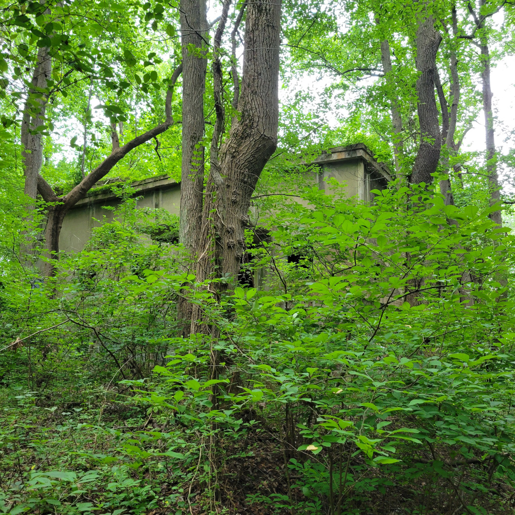
§ Present State
The interior of the power house in July 2025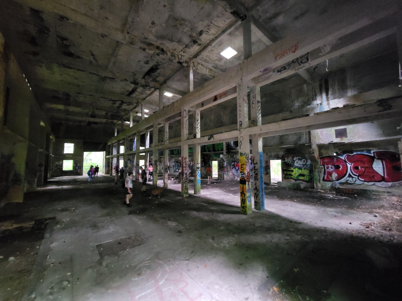
The building is in surprisingly good condition, given its age, but any such abandoned structure carries risk of structural failures leading to injury. In other words, enter at your own risk.
As of 2025, the concrete walls and support structures are still standing, but the interior is completely empty. On one side of the building, you can see patterns in the concrete floor where the boilers were located, and there are holes in the ceiling through which the boilers’ exhaust stacks passed. The back wall, behind where the boilers were, is open to the outside, with concrete columns supporting the roof. I’m unsure whether it was open during operation, or if there was some non-concrete wall that no longer survives.
The walls and columns in the building are covered in graffiti.
§ When Was the Power House Built?
In my research, I came across a number of different (but not that different) claims about when the power house was built. The 1914 Sanborn insurance map says it was built in 1905. Elmer Hall’s The No. 26 Sparrows Point Line says it was built in 1906, citing the UR&E’s ninth annual report, which covered the company’s activities in 1907. Hall’s claim seems to have flowed into a number of other publications; the most common date I came across for the building’s construction was 1906.
The UR&E’s eighth annual report, which covered the company’s activities in 1906 and was published in April 1907, says:
Recognizing that … it would be necessary to have an independent plant for operation of this line … the Maryland Electric Railways Company has purchased a suitable site adjoining Bay Shore Park and will erect thereon a power and lighting plant to be leased to your Company.
The UR&E’s ninth annual report, which covered the company’s activities in 1907 and was published in April 1908, says:
It was deemed advisable to locate a power plant in close proximity to Bay Shore Park, a site 500 feet back from the shore having been selected for this purpose, and a reinforced concrete building constructed thereon.
The deed establishing the purchase of the land for the power house (Baltimore County land records, Liber WPC 313, folio 10) is dated March 28, 1907, but that was a transfer from the North Point Land Company to Maryland Electric Railways. It appears that North Point Land Company was a shell company established to purchase and consolidate land for Bay Shore Park in advance of building anything. The section of land the power house is on was purchased by the North Point Land Company in 1905 (Baltimore County land records, Liber WPC 283, folio 162). It’s conceivable that the 1906 annual report was referring to the North Point Land Company’s acquisition when it said a site had been purchased.
Regardless, the company uses the future tense to talk about the power house in its 1906 report, and the past tense to talk about it in the 1907 report. That seems like solid evidence that the building was actually constructed in 1907.
§ Afterword
This was rather a lot of work to compile information on a building that was in use for just a handful of decades and has been abandoned for more than three quarters of a century.
Along the way, though, I found a fascinating number of intersections with the history of Baltimore, its trolley system, a couple old amusement parks, and the predecessors to BGE (now Constellation Energy), the MTA, and Sparrows Point. I hope, if you made it this far, that at least some of that was interesting to you, too.
§ Bibliography
Falter, Dennis. “The Baltimore Coal Car.” The Live Wire, 2004.
Hall, Elmer J. The No. 26 Sparrows Point Line. Gazette Printers, 2017.
Harwood, Herbert H., Jr. Baltimore and its Streetcars. Quadrant Press, 1984.
Historic American Engineering Record. Pratt Street Power Plant, HAER MD-101. National Park Service.
In Re United Railways & Electric Co. of Baltimore’s Reorganization, 11 F. Supp. 717 (D. Md. 1935).
King, Thompson. Consolidated of Baltimore: 1816–1950. Consolidated Gas Electric Light and Power Company of Baltimore, 1950.
Sanborn Map Company. Insurance Maps of Baltimore, Maryland, 1914, Vol. 5, p. 518. Sanborn Map Company, 1914.
United Railways and Electric Company of Baltimore. Collected annual reports 7–17. Baltimore: The Sun Job Printing Office, 1906–1916.
United Railways and Electric Company of Baltimore. Eighteenth Annual Report. Baltimore: The Sun Job Printing Office, 1917.
United Railways and Electric Company of Baltimore. Twentieth Annual Report. Baltimore: The Sun Job Printing Office, 1919.
And okay, this wasn’t a source for this article, but I absolutely have to talk about Bay Shore Park: The Death and Life of an Amusement Park by Victoria Crenson, published by W.H. Freeman in 1995. It’s an illustrated children’s book about nature reclaiming Bay Shore Park after all the rides and amusements were moved away.